SkinSimple
Digital solution for simple, effective and
personalised skincare experience
Background
For many beginners, building a skincare routine that suits their skin needs and personal circumstances can be a challenge. While skincare information is readily available online and via social media, the multitude of product options and advice come with the risk of misinformation and unnecessary financial costs due to unsuitable products. This creates a major barrier to finding effective skincare solutions, particularly for young adults. Recognizing this issue, our group decided to investigate this problem and develop a digital solution as part of the Interaction Design Studio (DECO2200) at the University of Sydney.
Project type
Academic
Role
UX researcher
UI designer
Video editor
Tools
Figma, Miro
Team
My Nguyen
Erien Simon
Yongqin Chen
Duration
3 months
Summary
Problem
How can we streamline the process of building a skincare routine that accommodates users' specific needs?
Outcome
We designed an interactive prototype and co-wrote a visual report of our end-to-end design process that achieved an HD.
01 RESEARCH
What we want to learn & how we do it
To ensure the solution is user-centric, our group first established two main objectives to guide the research process. We focused on investigating young adults (age 18 - 25) as they represented the largest consumer base in skincare industry and were most familiar with using online information:
Research objectives:
Identify how young adults navigate online skincare information and make decisions about routines and products.
Evaluate social and economic factors in shaping young adults’ approach to skincare.
With research objectives defined, we conducted primary research using interviews, questionnaires, content analysis, and online ethnography. Our aim was to uncover users' thought processes regarding skincare choices and identify their preferences and pain points when seeking reliable information. This combination of attitudinal and behavioral techniques also enabled us to collect both qualitative and quantitative data, thereby enhancing the depth and accuracy of our findings.
Key insights
After using affinity diagramming to analyze information and identify recurring themes related to user needs and challenges in current skincare practices, three key insights emerged:
Simplicity and familiarity
Users showed a trong preference for straightforward skincare routines using minimal and familiar products that aligns with their schedules
Efficiency and effectiveness
Time constraints, volume of information and conflicting online skincare advice impede effective learning and decision-making admists numerous product choices
Personalisation
There is a growing demand for personalized skincare solutions that are both effective and budget-friendly
02 DEFINE
Visualize insights into contexts
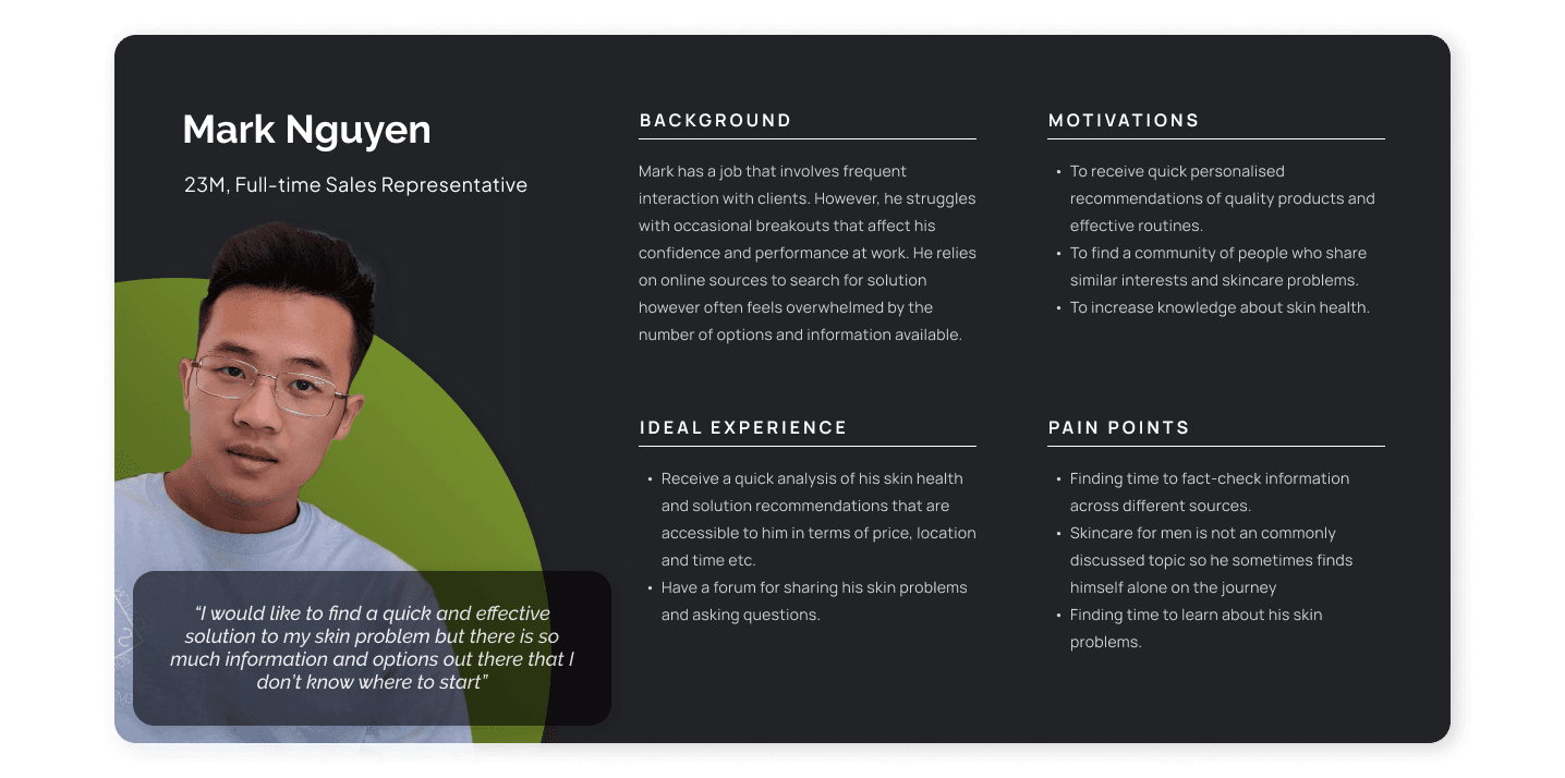
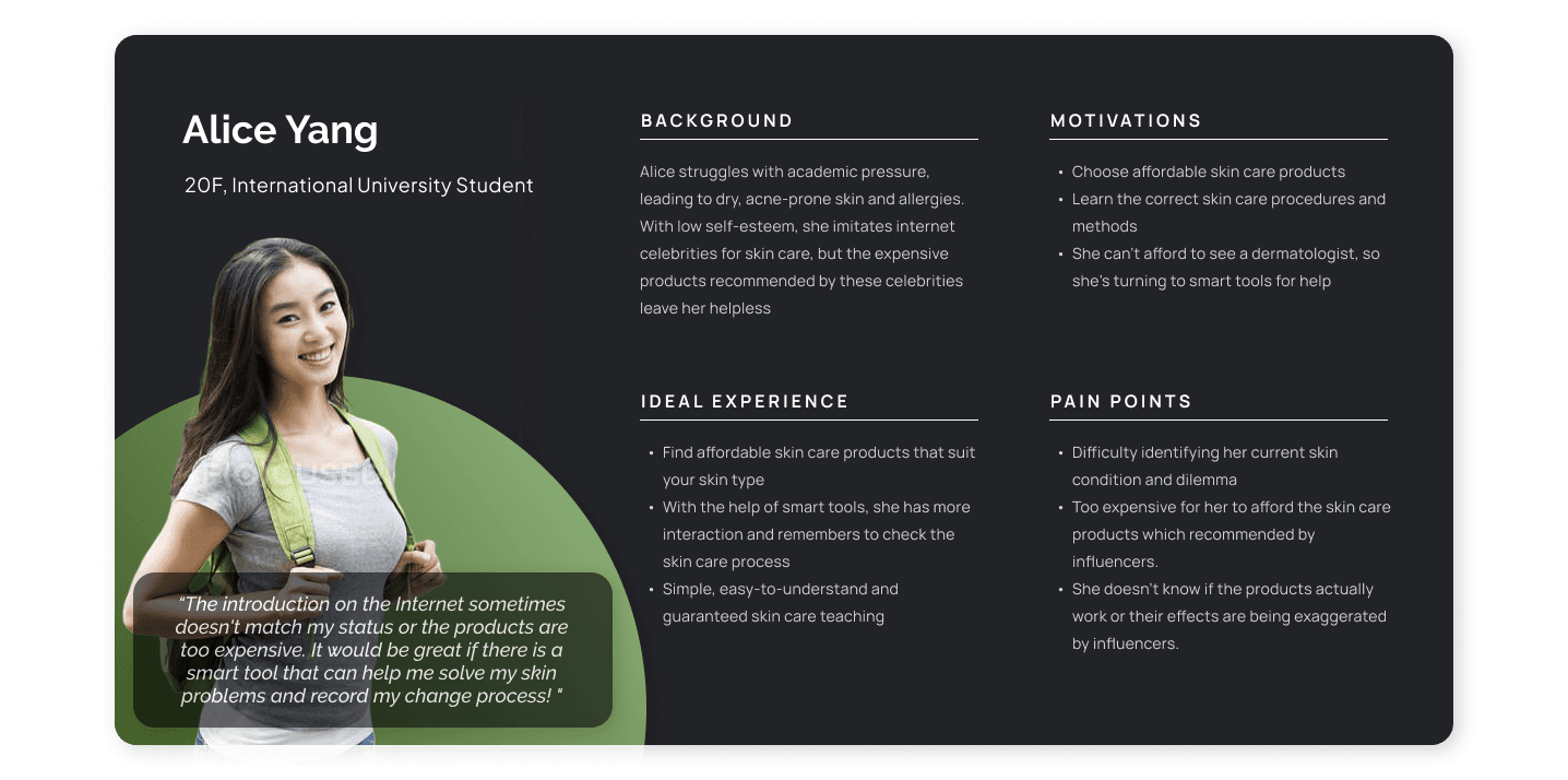
Three distinct user personas capturing diverse user groups with varying needs, goals, and skincare experiences emerged from our research. To further contextualize these personas' unique challenges, we've also created accompanying storyboards.
REFRAME THE PROBLEM
In the current skincare landscape, young adults are faced with an abundance of products and conflicting information, hindering efficient research and informed decision-making. While their busy schedule prompt demand for short and simple routines, the desire for product tailored to specific skin needs and budgets further compounds the challenge.
Brainstorm from various perspectives to generate suitable solutions
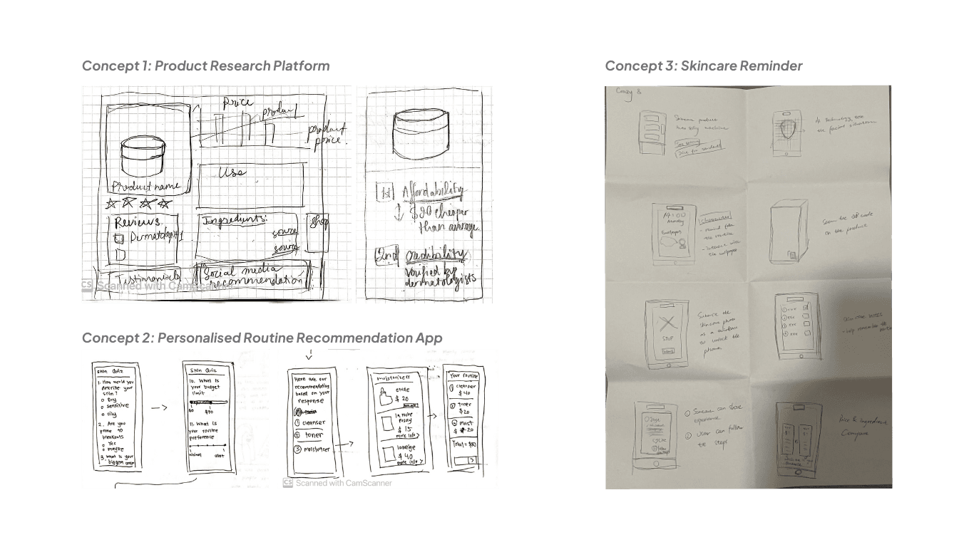
Placing these personas and storyboards at the center of our ideation session, we implemented a variety of ideating methods to generate 3 distinct concepts, each addressing specific user needs and usability requirements.
We then used a decision matrix to evaluate these concepts against criteria such as user needs, usability, and feasibility, while also identifying each concept's strengths and weaknesses. Interestingly, the scores were closely matched, suggesting that each concept held significant potential. Moreover, each concept seemed to address different facets of our research findings, suggesting that they could work well together. With this in mind, we decided to merge all three concepts into one comprehensive design.
Map out the features
Having an idea of what our solution could be, it was time to give it a structure with a sitemap. At this stage, we faced the challenge of deciding how many features to include without overwhelming users and overcomplicating the app. After consulting with our tutor and conducting some informal user tests, we decided the best option was to keep it simple to enhance the app's ease of use.
04 pROTOTYPE & TEST
Refinement of visuals and usability with rigorous testings and iterations
During our prototyping process, we underwent 3 rounds of iterations. We started with wireframes, then moved on to mockups, and finally developed a high-fidelity interactive prototype.
Due to time constraints, our team decided that each member would be responsible for the design of one main feature and its subsequent iterations. However, to maintain a cohesive overall design, we conducted usability testings and result analyses of all features collectively as a team. This collaborative effort ensured consistency across the board and helped us identify any potential issues early in the process, allowing for timely adjustments and refinements.
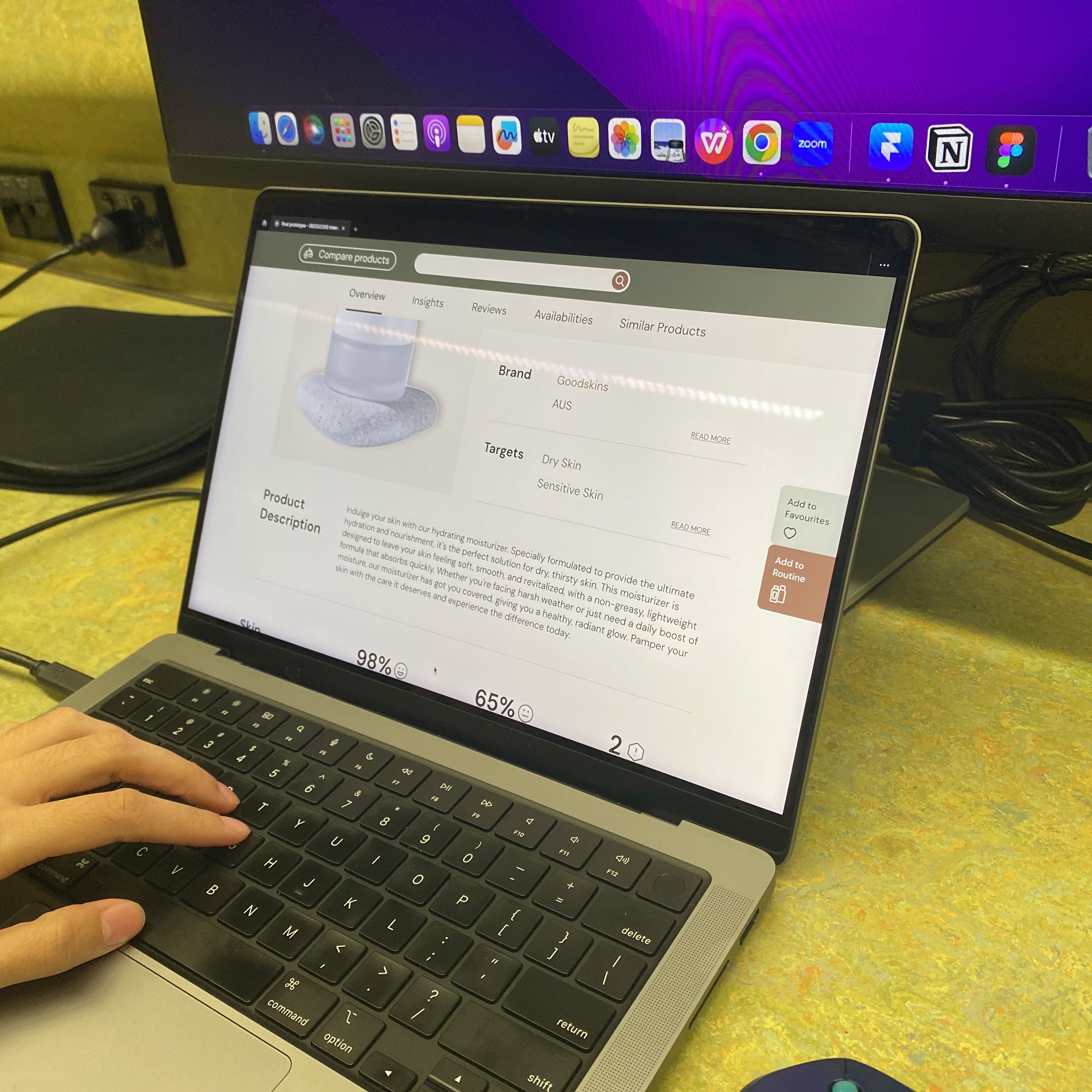
With this process, I was in charge of the “Explore Products” page, which will be the focus of this case study. This page aims to offer a comprehensive information on skincare products, including essential details like brand names and ingredients, and product compatibility. Additionally, reviews from different sources are included such as social media and blog articles to help assess the credibility of the products.
ITERATION I: WIREFRAMES
Determine a user-friendly and appealing layout for an information-packed feature
The most significant challenge I faced at this stage was determining how to make an information-packed feature look user-friendly and visually appealing. I tackled this challenge by drawing inspiration from the bento and Apple's widget designs to create extensive dashboards for skincare product information. I also used design patterns like e-commerce product gallery and comparison tables to make the app more user-friendly.
USABILITY TESTING I
Measure the usability of wireframes
We recruited 8 participants and employed 3 usability testing methods, accompanied by task scenarios to comprehensively evaluate the usability of the design. Then, a thematic analysis was implemented to analyze the data.
Key findings
Our SUS scores across participants range between 72.5 and 92.5, indicating a good system usability. However, there were some issues regarding the unclear wording and layout that impacted how fast users learned to navigate the app on desktop view and complete the tasks.
ITERATION II: MOCKUPS
Improve the desktop app experience by making tools more accessible and visible
Make the content more digestible with more negative space and emphasis on user-related information
Introduce a dedicated tab for reviews to declutter the layout and improve their access
USABILITY TESTING II
Heuristic evaluation revealed 3 areas of concerns
In order to improve our solutions' usability, we held testing sessions with 6 interaction design students using heuristic evaluation. This method involves identifying design problems by comparing the design against a set of guidelines. It helps identify major issues early on before proceeding to user tests. Thanks to this process, we were able to identify several heuristic issues that needed addressing:
Visibility of System Status
Ambiguous design elements and weak system feedback made actions hard to identify and complete, reducing learnability and efficiency.
Error Prevention
Inconveniently placed buttons and unfamiliar icons/images caused usability issues.
Aesthetic and Minimalist Design
Text-heavy pages needed more visualization.
Sections required more visual distinction and contrast.
USABILITY oUTCOMES
FINAL PRODUCT
SkinSimple is an all-inclusive skincare app that offers a comprehensive toolkit, essential guides and information to help users easily build and maintain an effective skincare routine, meeting their unique needs.
Onboarding Skin Quiz and Routine Recommendations
These features enable users to quickly fill in their lifestyle or product preferences and skin concerns so that the built-in AI algorithm can generate the most suitable skincare routine and products for users' specific needs and budget.
Skin Profile
After completing the skin quiz, user receives a skin profile that offers a myriad of helpful information about their skin and how to take care of it.
Explore Products
Offer a wealth of information on various skincare products, including essential details like brand names and ingredients, and product compatibility. Additionally, reviews from different sources are included such as social media and blog articles to help assess the credibility of the products.
Skincare Reminder
Encourage users to stay consistent with their skincare routine while reducing their cognitive load for remembering the steps.
Achievement
Make skincare more engaging and more motivating for users with a gamifying system. Users will acquire different achievement badges upon completing tasks or achieving a skincare milestone.
Promo Video
Conclusion
As this was my first design studio where I got to engage in an end-to-end design process in a group, it was full of excitement and valuable lessons. One of the biggest takeaways for me was that successful designs come from an iterative process that is informed by constant feedback. Whenever I was unsure about where to place a feature or how to layout information, seeking external perspectives from users, peers, or tutors proved invaluable. That's why user testing became a key focus for us. Investing time and resources into this phase provided crucial insights into user needs and preferences. Conducting multiple rounds of testing and iterating on feedback helped us refine our designs to better address user pain points and enhance usability.
When it came to teamwork, effective communication was undoubtedly essential. Regular check-ins, clear task divisions, and open discussions about design choices kept everything running smoothly. Plus, being organized with our assets, documents, and design files made a huge difference in our efficiency.
Overall, this design studio experience taught me the importance of an iterative, user-centered design process and highlighted the value of strong collaboration and organization within a team. These lessons will undoubtedly shape my future projects and professional growth in the design field.


